Meesho Introduces New Logo to Broaden its Appeal to a Diverse Customer Base

News Synopsis
Meesho's Logo Transformation Reflecting a Diverse Customer Base
Meesho, an e-commerce platform preparing for an IPO, has decided to revamp its logo after nearly eight years. The decision comes as Meesho has experienced a significant shift in its customer demographic, with an equal number of male and female shoppers and a growing number of young buyers.
Vidit Aatrey, co-founder and CEO of Meesho, stated that the company's earlier focus on women entrepreneurs has expanded to include consumers across all genders and age groups.
The New Logo: Embracing Inclusivity and Vibrancy
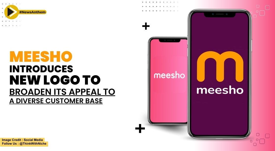
The new Meesho logo preserves the recognizable "m" symbol while incorporating a fresh color palette. Moving away from the previous white text on a pink background, the revamped logo embraces a combination of new colors.
The aim is to resonate with the younger audience, particularly those between 18 and 25 years old, who are increasingly engaging in online shopping. By refreshing its brand identity, Meesho aims to align its image with its current business offerings and diversify its appeal.
Meesho's Evolution as a Horizontal Platform
Meesho's decision to broaden its offerings and become a horizontal platform has been instrumental in its logo transformation. In addition to women-centric fashion products, Meesho has expanded its product categories to include books, automotive parts, and more.
The rebranding efforts signal Meesho's commitment to adapt to the changing market dynamics and cater to a wider range of consumer needs. This strategic move positions Meesho as a comprehensive e-commerce platform capable of serving diverse customer preferences.
Significance of Logo Changes and Brand Communication
Industry experts, including Samit Sinha of Alchemist Brand Consulting, highlight that logo modifications are common when companies aim to communicate their evolution and enhanced offerings to customers.
Meesho's logo transformation signifies the company's commitment to growth and innovation. By signaling change, Meesho aims to assure customers that it remains at the forefront of e-commerce trends and continues to offer additional features and improved user experiences.
User Adaptation and Future Outlook
Meesho acknowledges that it may take some time for customers to adapt to the new logo. However, the company is committed to facilitating a smooth transition and ensuring customers resonate with the updated brand identity. While many new-age companies reduce marketing expenses, Meesho remains focused on growth and will continue to invest in marketing efforts to familiarize users with the new logo.
Meesho's Financial Outlook and Prudent Approach
Meesho's recent cost-saving measures, including layoffs and reduced spending, have significantly reduced its monthly cash burn rate. As a result, Meesho's CEO, Vidit Aatrey, affirms that the company will achieve profitability in the next quarter or two. Consequently, Meesho does not foresee the need to raise additional capital. Instead, the company will maintain a prudent financial approach, emphasizing profitability and exploring opportunities such as ESOP buybacks.
Conclusion
Meesho's logo transformation reflects the company's evolution and desire to cater to a broader customer base. With an inclusive approach and an expanded range of product categories, Meesho aims to provide a comprehensive e-commerce experience for customers across genders and age groups. By introducing a vibrant and modern logo, Meesho aims to resonate with the younger generation and ensure that its brand identity aligns with its current business offerings.
The decision to rebrand the logo signifies Meesho's commitment to growth and innovation in the highly competitive e-commerce market. The company's expansion into new product categories and its focus on becoming a horizontal platform highlight its determination to meet the diverse needs of its customers.
While it may take time for customers to fully adapt to the new logo, Meesho remains dedicated to facilitating a seamless transition and ensuring that users resonate with the updated brand identity. The company recognizes the importance of effective communication and marketing efforts to familiarize customers with the new logo and reinforce its commitment to providing an enhanced e-commerce experience.
Financially, Meesho's prudent approach, including cost-saving measures and a focus on achieving profitability, sets it apart in the current business landscape. With a reduced cash burn rate and a positive outlook for profitability in the near future, Meesho does not foresee the need to raise additional capital. Instead, the company remains committed to creating value for its shareholders while exploring opportunities such as ESOP buybacks.
As Meesho continues its journey as a leading e-commerce marketplace, the new logo symbolizes its determination to stay at the forefront of industry trends and adapt to the ever-changing demands of its customers. With its commitment to inclusivity, innovation, and financial prudence, Meesho aims to solidify its position in the market and provide a seamless and enjoyable shopping experience for customers of all backgrounds and preferences.
You May Like


